2024 Fashion Trends: Monochrome Outfits
Happy Saturday, all! Time for another look at 2024 fashion trends with this week’s peer into monochrome outfits.
Monochrome outfits are also considered timeless, high impact, effortless, easy ways to dress.
However, this year, it is a trend…because so many brands are styling these looks.
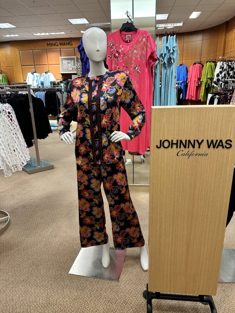
Predominately, monochrome outfits are in one color; however, since it is among the 2024 fashion trends, you also see some this year in all prints, like the JOHNNY WAS SILK AT DILLARD’S.
And they are described that way by professionals in the industry.
The advantages of wearing monochrome outfits are mostly simplicity, slimming appearances, affordability, and some would say…elegance.
According to Harper’s Bazzar,
Monochromatic outfits are one of the most impactful ways to stand out in fashion. A head-to-toe ensemble in one shade, even in a neutral brown, gray, or black, conveys a sense of irreverence and put-togetherness all at once.
Hmmm…looking at it that way, monochrome outfits would be in my style adjectives…polished, approachable, joyful, current, and creative.
I do like how the look creates a blank slate for powerful accessories, but I realize that may be leaving the area of simplicity.
So, let’s look closer at monochrome outfits in the 2024 fashion trends……
2024 FASHION TRENEDS: MONOCHROME OUTFITS
Since this hits in the 2024 fashion trends, I am discovering monochrome looks everywhere I go…and also discovering what some women think.
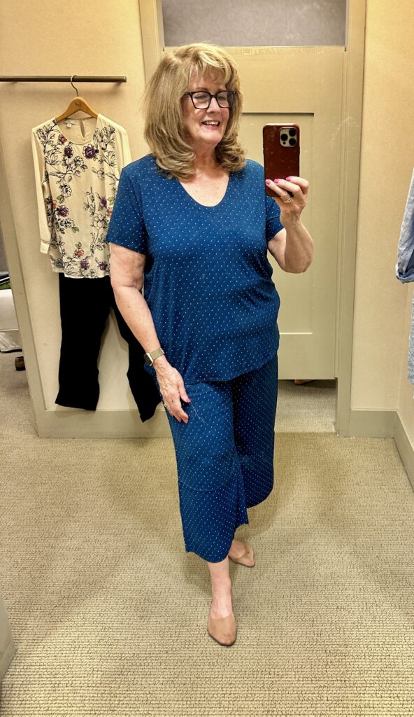
I tried on this in the JJILL WEAREVER COLLECTION last week, and listened to one woman in the dressing room tell me that it is too much like pajamas.
I have also heard some call monochrome outfits too “matchy-matchy.”
(BTW) I will have more from my JJILL try-on session on Monday.
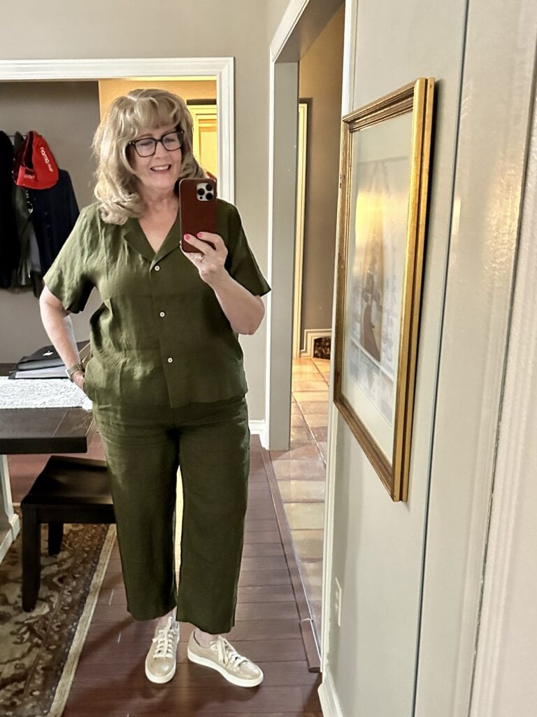
Quince is another brand where you can find 2024 fashion trends, such as monochrome outfits.
I wear this casual look from QUINCE LINEN.
I also like how Quince offers so many colors if you want monochrome style, and they have a pajama monochrome outfit I would wear out and about…not just for sleep.
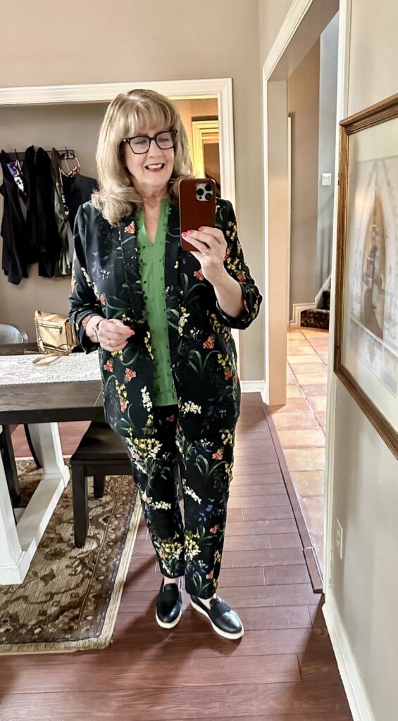
My favorite “matchy-matchy” look this spring has been this one from Chico’s…but I did not take it full on like some women do with the matching blouse…mostly because I want this verdant green closer to my face.
But I do love wearing the jacket and pants together and also with separate pieces.
This is the RUCHED SLEEVE BLAZER, with the BRIGITTE FLORAL ANKLE PANTS.
Here is a slideshow of brands that style monochrome outfits for you which makes it a little easier to envision:

2024 FASHION TRENDS: SAVINGS CODES
With so many fun 2024 fashion trends this year, I am honored to be working with brands that offer YOU (my amazing audience) savings codes for your purchases.
Here are the ones currently available to you…
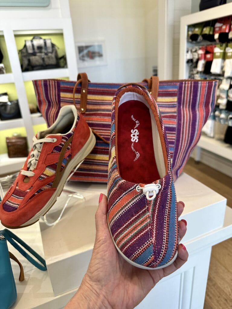
CODE: SASPAM10…good for $10 off your purchase of SAS SHOES through April 23…and good in store or online. Check out that new Baltic Collection!
CODE: PAMELA20…good for 20% off your purchases all year long of EASY SPIRIT SHOES
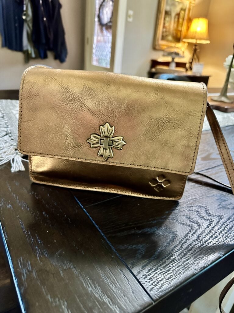
CODE: PAMELA10…this saves you 10% on the beautiful PATRICIA NASH HANDBAGS…one of my favorite brands for handbags
And, finally, BY BRIAN SKINCARE AND MAKEUP PRODUCTS….
The CODE is pamelarefresh for 25% off (Including a workshop special) which is good until April 16, and for those who missed the Spring Refresh Skincare Workshop, here it is……so much fun to see your faces!
Thank you for joining me today for 2024 Fashion Trends…please leave any thoughts you have on monochrome outfits…are you in or are you out?…and I will hopefully see you tomorrow!
STAY STRONG & KEEP SMILING!
By Pamela Lutrell
Please remember to shop with my Shopping Links found at the top of the page. Thank you so much to those who shop this way.
![]()
I like the ease of the monochrome look. My first thought on the polka dot outfit was pajamas so I laughed when I read that someone else said that. If you added some cute jewelry it would look less pajama like (maybe). Happy Saturday!
Happy Saturday! Monochrome certainly is easy!
My first thought on the blue polka dot outfit was pajamas also!
We have more agreement with the dressing room friend!
Good morning! I am ‘out’ of monochrome looks on me. That being said, I will wear a solid monochrome base if I have a contrasting third piece that I know I won’t take off. I, like the woman in the store, look as if I am wearing pajamas. I can get away with one color in different tones if there is texture involved. I add in other colors with accessories. As a deep autumn, I look my best in contrast and with 3-5 colors at a time. If I don’t, I look very boring! Great topic. Can’t wait to hear what others say.
I am like you, Deborah. My favorite way to wear this is as a column of color underneath a third piece…
How funny. My first thought on the polka dot combo was also “cute pajamas”. I think the soft, unstructured and unpolished styling of the 2 pieces combined with polka dots reads pajamas. Looking at the photos in the slide show I found most of the outfits boring. I noted the lack of accessories which can make all the difference. I did the the outfits from Haven and Quince though I thought they would look better styled with accessories. I think monochrome looks better with at least one item having some structure or style to keep the outfit from looking like pajamas or what we used to call a sweatsuit. I will wear a monochrome outfit but with more structured pieces so it more or less resembles a suit or a jumpsuit. Mostly like Deborah I prefer my monochrome to be two or more values of the same color. This works well for me in olive and mid warm browns. Seems I remember this was big in the 1960s with matching skirt & sweater sets. I had one in yellow. What a fun topic.
It is fun! Glad you enjoyed it, Kathie!
I agree with Kathie and I could get on the monochrome solid colour train with accessories but not the floral train. In my eye they are a ‘ look at me’ fashion statement. If you feel comfortable having everyone look your way when entering a room I admire you. It would look like a beautiful garden if everyone in a theater lobby had on this fashion statement. Just what came to my mind on this fashion trend on a dreary cold morning where Spring has yet to sprung.
Maybe. I think the monochrome look works with certain fabrics ( denim for example) and not with summery short-sleeve and cropped pant gauze. Linen might work -id have to see the pieces in person.
Thank you for sharing this Pam. I loved you in the vibrant printed blazer with pants!
Pretty! Stunning! I agree with your theory of adding accessories!
I think you know, Linda…I do not mind having people look my way as long as I am speaking my adjectives. I want to enjoy each day and not be a wallflower…but I know that is just me.
That is my favorite spring outfit right now, Paulette. It fits well and is a little bit bold and fun. Thanks
I like the idea of monochromatic looks, but because my personal preference is a more classic tailored look, I find that most of the monochromatic outfits featured are not for me. They seem to be oversized, & as others have mentioned, they do remind me of pajamas. I am not a fan of all over prints for myself, but your blazer & pants are very attractive on you. The fit is very nice.
Thank you Becky. It is fun to have a look like this in my wardrobe…even if it is the only one! I have enjoyed it.
I just tried to place an order with Brian, but the discount code of PAMELAFRESH did not apply. Help, please.
Sending to Brian!
I love a column of color! It can be the same color or shades of the same color. I’m short at 5’2” so it is more flattering than a pattern or two different colors. I bought the Quince navy blue pajama set. It is definitely going to be worn as clothes by me not as pajamas! The linen is so soft! It will be comfortable on hot days. It is sunny and heading for 82 degrees here today! We could use some of your rain.
We needed it so badly, Sydney. It has been a long long time since we have seen rain like we got this week. I hope the same blessing comes to you!
Sent you an email. The code is pamelarefresh and it should work. Let me know if you have problems and what it says. Respond in email.
Personally I don’t think one needs to dress in head to toe Chicos to be noticed and not appear as a wallflower. After watching all the videos on fashion one thing really stood out to me – the absence of loud patterns and oversized flowy tops. What I noticed was a lot of solid colors with a focus on tailoring to compliment one’s figure. Blouses were tucked in and belts worn. None of these women would appear as wallflowers and would be immediately noticed if they walked into a room. The clothes complimented the women instead of over powering them.
Hi Sonja, I don’t believe anyone said that, but thanks for joining in with your thoughts.
Depending on the fabric, I like a column of color. My personal preference is solid navy, black or white worn with a contrasting jacket. I personally do not like prints in a pant set as they do remind me of pjs. I agree that it might have to do with the type of print or fabric. I might not be anti if it were a skirt and top, though. Everyone dress to your adjectives and enjoy!
Exactly, Kathy! Dress to speak your own personal adjectives and then walk out with confidence!
On my way out the door Friday, I took one last look in the mirror and Whoa! too much going on. I had curled my hair, had on a print scarf and was wearing a colorful jacket. I’m a light, low contrast, petite “Summer”. I read somewhere that a tonal/monochromatic look is more pleasing to the eye. A look with a lot going on confuses the eye. Your eye is darting from one detail to another. You want the eye to settle on your face.
Thanks for sharing Lily!
I find the ‘too’ matchy matchy sentiment interesting, albeit a little foreign – it seems western dress favours contrasting instead of matching to create ‘looks’, but then no one so much as bats an eye at a two-piece suit (as you deftly demonstrated) lol! I agree that structure has a lot to do with it too, but I like the fact that such ‘co-ords’ are back – I think it looks good on women with inherently lower value contrast, since it creates visual cohesion.