Color Interpretation: Eileen Fisher’s cassis
Woo-Hoo, it’s Friday and welcome to my discussion of color interpretation: Eileen Fisher’s cassis.
This week I have been showing you the colors in my closet that work for my new Autumn Color palette, particularly items I decided to keep.
We have looked at Kingfisher Blue and Rosewood, only to discover there are many interpretations of these colors!
I ended up ordering a Rosewood Sweater suggested by one of you, which is the darker version of rosewood. I cannot wait to see it…it is on online exclusive color at Ann Taylor
But, completely different from the rosewood I was searching!!
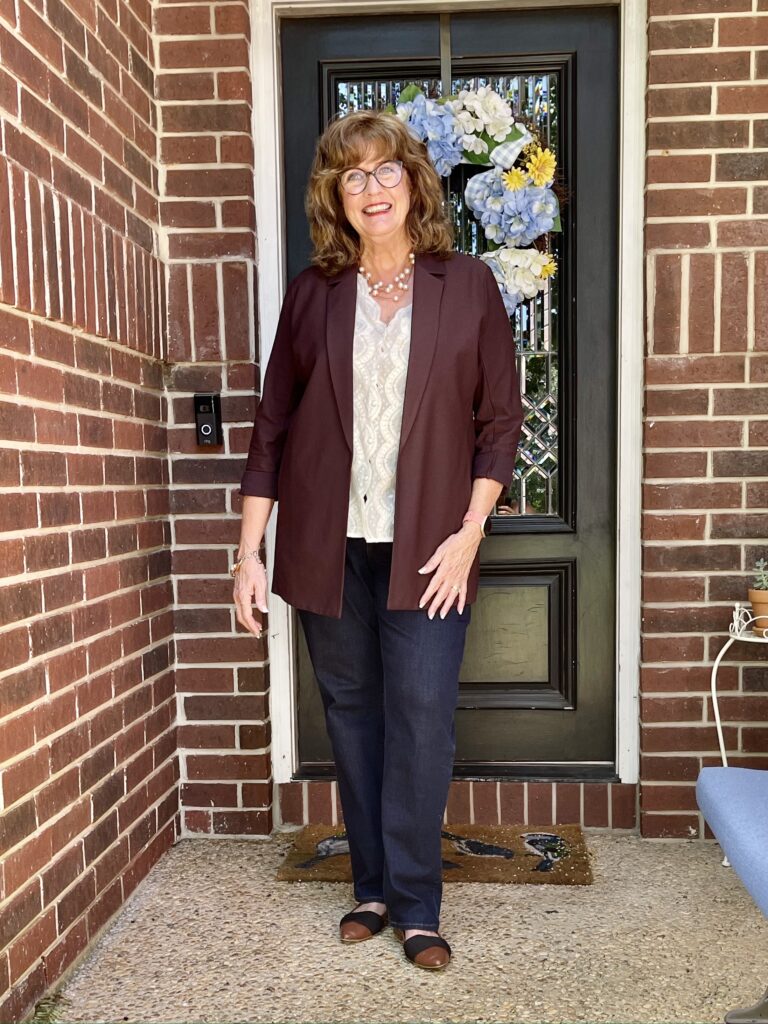
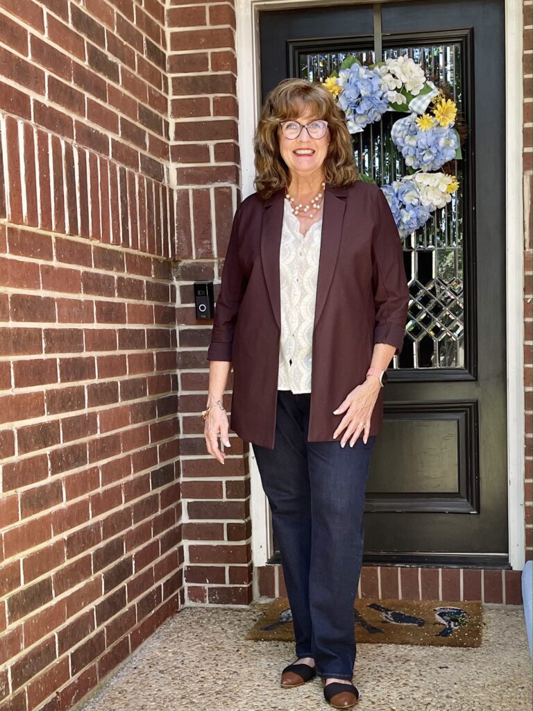
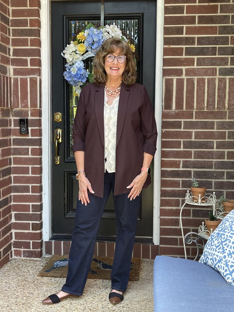
This Eileen Fisher jacket, which I decided to hang on to, is another interesting color to me: Cassis.
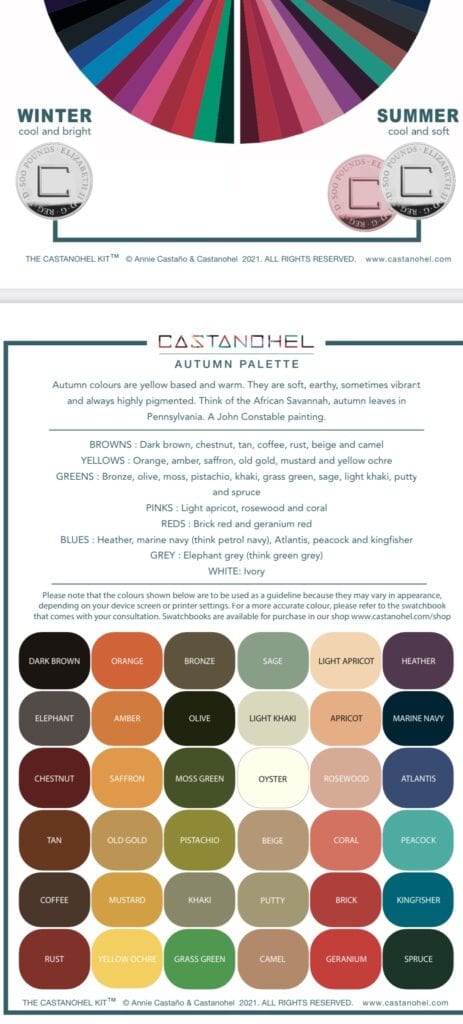
I see a color that is close to the Chestnut color in my autumn palette….Leigh Ann sees purple…another friend sees brown…and a Dillard’s associate insists that it is burgundy!!
If you just search, WHAT COLOR IS CASSIS, you are told that it is a darker greyish purple.
Pretty great color that it can accomplish all of that! I do love the jacket…it is lightweight and longer and I think fits my palette whether it has its own box or not. I can do a lot with it for fall.
MY ROMANTIC STYLE
I chose to go with the romantic side of my new bohemian/romantic style when putting a look together for this jacket.
The ecru lace top is from Ralph Lauren and I found it recently at a consignment shop. It is sheer, but perfect for under a jacket. The shoes are past Halogen flats from Nordstrom, and the jewelry was made a local designer, Susan Butler.
She is an amazing talent…and the link goes to her Amazon shop….featuring her shop where she blows her own glass beads.
I think the pearls and leather work well for a denim style. These are my bootcut jeans from Chico’s.
Here are some additional Eileen Fisher pieces in Cassis for you to see and draw your own interpretation of the color…..
Simple, affordable lace tops are almost as elusive as some colors are…you can see here that I found Ralph Lauren in places from Walmart to Saks Fifth Avenue!
I have rarely worn much lace, but styling it under a jacket like this does work for me and I warmed up to it quickly.
So tell me, ladies…what color do you see when you look at Cassis and do you understand why I kept this jacket?? Would love to hear from you…thanks for being here…and always…
KEEP SMILING!! (I know it is Friday the 13th, but I choose to believe it is going to be a great day!)
By Pamela Lutrell
Photography by Leigh Ann Cecil


Hello from UK Pamela – your jacket looks brown to me. Have you heard of UK firm Kettlewell Colours? They do a colour called rosewood that on my monitor looks a lot like the rosewood top you featured in earlier post. Only 3 items in that colour at the moment. The also have many items in cassis and theirs definitely has a purple tinge. Stock is mainly tops but do have a few trousers. You can choose to look at the full range or only garments in your season
Good morning, Audrey! Yes, I like what Kettelwell does! Thanks for sharing.
Hi Pam, I’ve been following your colours journey with interest as I was trained in “Colours” back in the 80’s and find the new colour systems fascinating. You should compare the “Cassis” colour, in natural daylight, to your Autumn fabric colour swatches to see if it blends in. Keep in mind that colours will look a bit different in different fabrics and sheens, but it should blend to your swatch.
To me this colour does not look to be in the Autumn pallet as there is no warmth to it. It looks like it is trying to be what we called “oxblood”, but again not enough warmth. Better kept as a bottom, rather than close to your face, although you will still have difficulty blending it to the rest of your pallet.
Also, keep in mind that a colour name that Pantone uses, isn’t necessarily the name the designers or retailers are using so that just adds to the complication of searching online for an exact match. Good luck with your reinvention.
Thank you, Yvonne!
I see raisin! This outfit is so classy, I just love it! What is interesting is how you can create such completely different looks and still be the authentic you. This is the fashion world I live in Pam. You know I love minimal, classic looks and feel best in them, feel like me. But I definitely have this other side that can’t walk past a flowing, embroidered top, and I love Johnny Was! Hardly makes sense, you know? I wonder if I can just have my little “classic with a touch of bohemian” and run with it! I think so!
I think so too!! I forgot about raisin! I think that is a perfect description!
good morning! one of the comments said it well, the colors on some things will be different in the house than in the sunshine….ive done that a few times, get dressed thinking ive found a good combo, then go outside and the shades be so different it bothered me all day…lol.
jacket has such a mild tint of red over the brown, im not sure how i would catorgarize it.
but it does work for you!
I have done that too, Sheryl. Did it too often when rushing off to the workplace!! Thanks for joining in!
Someone just said the word that popped into my head when I look at your jacket—raisin! It’s also close to those Talbots Tortoise shell pants you tried on earlier this week. Brown-burgundy – like a hybrid color. Whatever the shade name, wearing it with ivory or white (autumn palette) causes it to pop! Very nice!
I see straight up brown! Not a color I can wear but looks great on you.
Thanks Paulette…it is actually very different from those pants…but they are a color I am in love with!!
Thank you, Kim!
And here lies the problem of not having physical swatches to go by. The names of a colour mean such different things to different people and even in some cases the names are trademarked so this is where the strange names come in. On my screen this colour does not look vibrant enough so that causes another problem with the interpretation. I find that whether indoors or out, if the material matches my fabric swatches it should be right. I wonder if Kettlewell is approved by Annie for matches. There are so many names of colours there it is astounding.
I will check with Annie! I agree that it can be overwhelming with some colors! But it is fun too!
Oh my, so many folks see it differently. I see a deep chocolate wine color. OR, as I look over the Autumn palette- it looks close to Chestnut!
Interesting…isn’t it? How differently a color can be seen!
Another interesting post about color. Since I’m also an Autumn you really have me thinking about color and have also shown me why I gravitate to certain colors. While I don’t often comment but do read all of your posts I have to tell you that you that your decision to embrace your natural hair with beautiful waves has made a remarkable change in your appearance. You look happy, vibrant, and more youthful. I’d call the color of the jacket Fig and have seen some items called that and do think the color is not one that is often seen but very flattering. Thanks for your posts I look forward to them.
Thank you, Sue!! So kind…and this would be close to the color Fig!
I would call this maroon or chestnut. I have a sweater in this color in my closet, and it looks good with my blue autumn coloring. I do get a slightly cooler vibe than I would from something golden, but I still like it on you. I’m sure we can pick some color blends … for example, I don’t see eggplant on the autumn palette, but it is an amazing color on me, being just a deeper version of the heather that is shown. If you are unsure, maybe try it with camel or gold underneath, which would pull out the brown/red tones.
As another Autumn I’m following your color journey with great interest. I’m loving your selections and really appreciate that most are in a moderate price range. Thank you. I have an Eileen Fisher sweater in cassis and I love it; it’s a keeper.
Thanks for sharing, Suzanne!
Good morning! Colors are sooo interesting! I had ordered the Kettlewell Arabella dress in casis, but it seemed to have a burgundy tint to it so I sent it back. My stylist told me to stay away from burgundy. Maybe that is why it popped out on me. It did blend with my deep autumn palette but had doubts about the underlying color. Plus, the fit wasn’t quite perfect and I have decided that if I can’t have perfect, there is another piece somewhere waiting for me. I am still upset that I donated a raisin top after retiring from teaching. No hint of red in that. Your outfit looks fab! I am going to pull out an ivory lace fitted jersey purchased from the now nonexistent Travelsmith and just wear it with a few toppers similar to yours that I have in deep olive, chocolate, etc. Thank you! I look forward to your blog every day.
So glad I could give you ideas, Deborah!!
I agree with the comments that this looks like Raisin or Fig. I would love to see this with a scarf that pulls in more of your autumn colors. The bird illustration the other day has stuck with me, and I am evaluating overall outfits by asking myself if the combination is out there in nature. Perhaps there is an animal or flower with this fig color, paired with the perfect complements. 🤷♀️
I agree with those who said Raisin. There is too much brown for burgundy or purple, but I suppose it depends on the lighting & the monitor you’re using. It reminds me of the What color is this dress” controversy of a few years ago.
What a fascinating discussion! I see brown on my monitor, which isn’t helpful at all, but I do know the figgy-raisin shade you’re talking about & think it would go well with your colouring. I like the fit of that jacket on you, too. I think the slightly longer profile is very flattering. This whole indoor light/outdoor light thing is so important. We finally decided on the colour for our hardwood floors in the house we’re building, after weeks — WEEKS — of looking & talking & comparing. We finally took samples to the building site to see the colours in the actual light the house will be receiving & even then, who knows what the final result will be as seasonal light here changes dramatically & we’re also overlooking the water, which teases the eye into seeing things with a bluish tint. I’ve decided to not overthink the whole process, especially when we start picking paint colours. And we wonder why deciding on what clothing colours suit our skin tones & personality is so difficult! I’m starting to admire the transformation you’ve embarked upon more than ever.
Good idea, Linda on wearing with the camel or gold…will see what it looks like. I love eggplant will continue to wear it!
I think nature inspired is always a good way to go…thanks Connie!
It is kind of like that controversy…isn’t it, Becky. Raisin and fig are popular choices today!
You have a much bigger project going on, Janet…but how much fun. I am jealous that your new home will look out over water! Thanks for the encouragement…I am so pleased and surprised at the positive changes this has resulted in.
I see a brown with burgundy undertones. Whatever the color, it looks great on you. The entire outfit is very put together! And as someone else mentioned- your joy in the styling and colorways shines through!
Thank you Carolyn!
Hi Pamela,
I am really enjoying your posts on colors . I have been working on mine as well since I started reading about your wardrobe journey. I am also an autumn! I recently bought a pair of pants in a color similar to the jacket you are wearing and they labeled the color “raisin “.!! I think you really look amazing in your new color pallet!
As we head into another blast of heat, fall sure does look good on you.
Thank you, Jean! Have fun with yours too!
I understand…this is our hottest time of summer!
I think Cassis sounds far more mysterious and interesting so I would stick with that. It is a great color on you. Just a thought… if your underpinning was smooth instead of textured, it would draw the eye to your pretty neckless and thus, your face. Think about it 🙂
I will think about, Suzanne. I really like this blouse with the jacket. But I am open to different ways to wear it. Thanks.
That jacket is stunning on you! I love the color. I see a deep rich brown. It works so well with the ivory top. I don’t know about the pants with it, but I’m at a loss as to what other pants color would be better! That’s a tough one. It all looks pretty on you though. It’s amazing that it’s old…you must have sensed something about it when you bought it!
Happy weekend!
Thank you, Nancy! Happy weekend!
Hi, cassis is a liqueur made from blackcurrents so I would imagine the colour to have that dark berry shade. Nice colour.
Good point! Thanks for making that observation!
I like the cream top with that jacket.
I think it accentuates your face and the wonderful color of your hair.